Most businesses think of their logo as one image. In reality, a strong brand identity needs several logo variations, each built for a different job. The full logo that looks great on a website header will get crushed and unreadable as a favicon. A mark designed for a business card won’t hold up on a billboard. Businesses that present their brand consistently across every platform tend to see an actual financial upside too. According to Marq’s State of Brand Consistency research, companies that keep their branding consistent across channels see revenue climb by 10 to 20% on average.
Here are the four main logo variations every business should have on hand in their brand guidelines, and where each one belongs to create a consistent visual identity.
The Primary Logo Is Your Brand’s Full Statement
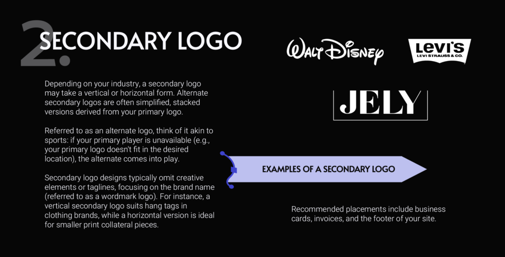
The primary logo is the main, most complete version of your brand mark, the one everything else gets built from. It usually includes the fullest expression of the brand including: the name, sometimes a tagline, an icon or illustration, occasionally even a founding date.
Walt Disney’s full studio logo, with the castle and script wordmark together, is a primary logo. So is Levi’s original patch mark with the full company name and founding details. Coca-Cola’s classic script, often paired with its tagline, works the same way, it’s the most recognizable aspect of the brand, and also the most detailed.
Primary logo design carries the most detail, so it needs room to breathe. It works best on a desktop website header, large signage, or anywhere there’s enough space for it to be read clearly. Shrink it down too far and the details start to disappear.
The Secondary Logo Gives You A Different Shape To Work With
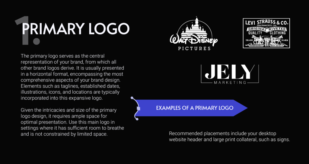
The secondary logo is a rearranged version of the primary, usually built for a different orientation. If the primary logo is wide and horizontal, the secondary might be stacked vertically, or vice versa, giving a business two different shapes to work with depending on the space. It typically drops some of the extra detail, like a tagline, to stay legible at a smaller size.
Disney’s script “Walt Disney” wordmark and Levi’s red batwing tab are both good examples, simpler and more flexible than the full primary version. Secondary logos tend to show up on business cards, invoices, email signatures, and footers, anywhere the primary logo would feel too large or too detailed for the space.
The Submark Logo Is Built For Small, Busy Spaces
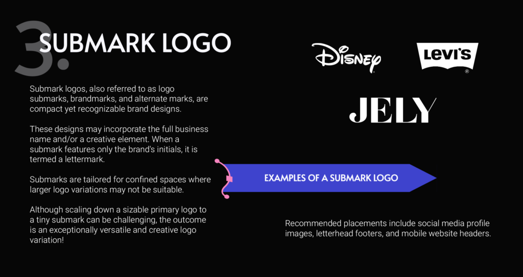
A submark takes things a step further. It’s a compact, standalone mark, often just an icon, a monogram, or the brand name reduced to its simplest form. Some submarks drop the full name entirely and rely on a symbol or initials to carry the brand.
This is often the version of a logo people see the most, since it lives on social media profile photos, letterhead footers, and mobile website headers. Disney’s rounded “Disney” script, Levi’s leather patch icon, and Coca-Cola’s contour bottle silhouette all work as submarks, instantly recognizable even without the full company name attached.
The Favicon Is The Smallest Detail That Still Represents Your Brand

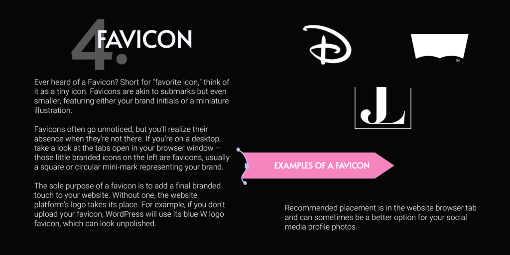
A favicon is the tiny icon that shows up in a browser tab, usually just brand initials or a miniature illustration. It’s easy to overlook until it’s missing. Skip uploading one, and most website platforms will default to their own branding instead, WordPress shows its blue W, for example, which looks unfinished on a business’s own site.
Favicons are small enough that most of the detail in a primary or even a submark logo has to be stripped away. Legibility matters more here than anywhere else in a logo suite, since what’s left needs to be simple enough to read at a glance, sometimes just a single letter or shape. Beyond the browser tab, a favicon can also double as a social media profile image when a fuller logo won’t scale down cleanly.
There’s More To A Logo Suite Than Just Four Versions
Primary, secondary, submark, and favicon cover the core shapes a logo needs to take. Color is a separate layer on top of that. Every version above should also come in a monochrome option, since not every application supports the full color palette, printing on a dark background, embossing on a product, or a black and white document all call for a version that works without color. Some businesses also build what’s called a responsive logo system, where the logo simplifies automatically depending on screen size, so a detailed version loads on a desktop and a simpler one shows up on a phone without anyone manually swapping files. None of this has to be reinvented project by project. It gets documented once in a brand style guide, so anyone touching the brand later, an employee, a printer, a freelancer, knows exactly which version to use and when.
Why Having All Four Matters
None of these variations replace the others. They work together, built from the same core assets, each one doing a job the others can’t. A business that only has one version of its logo will eventually run into a situation where that logo doesn’t fit, gets stretched, or loses legibility, usually right when it matters most, like a new social profile, a favicon, or a piece of print collateral on a tight deadline.
Having the full set ready ahead of time means a business never has to make an awkward compromise on how its brand shows up. That consistency is also what builds recognition over time. The more a logo, in whichever form fits the space, stays visually connected to the same brand identity, the faster people learn to recognize it without even reading the name. In a crowded market, that kind of instant recognition is part of what differentiates one business from another, and it can influence buying decisions more than most businesses give it credit for. Research from Akeneo found that 52% of consumers say they’re willing to pay more for products from brands that clearly communicate their values, and 82% of that group said they’d pay up to 30% more.
Building out a full logo suite takes more than design skills alone. It takes the kind of thinking a brand designer or creative director brings to the table, backed by brand strategy, market research into how competitors and target customers in the industry perceive things, and careful execution so every version stays consistent as it carries through to a business’s website, social profiles, and print materials. That’s the kind of work JELY Marketing handles as part of our branding services. If your business is working with a single logo file and starting to feel the limits of that, request a quote and we can talk through what a complete brand identity should look like for you.